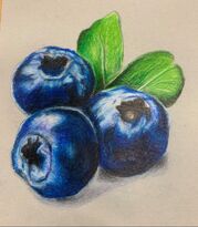
Art 4
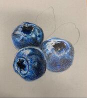
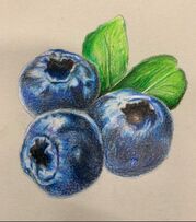
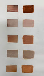
Prismacolor Practice
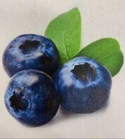
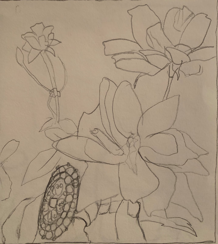
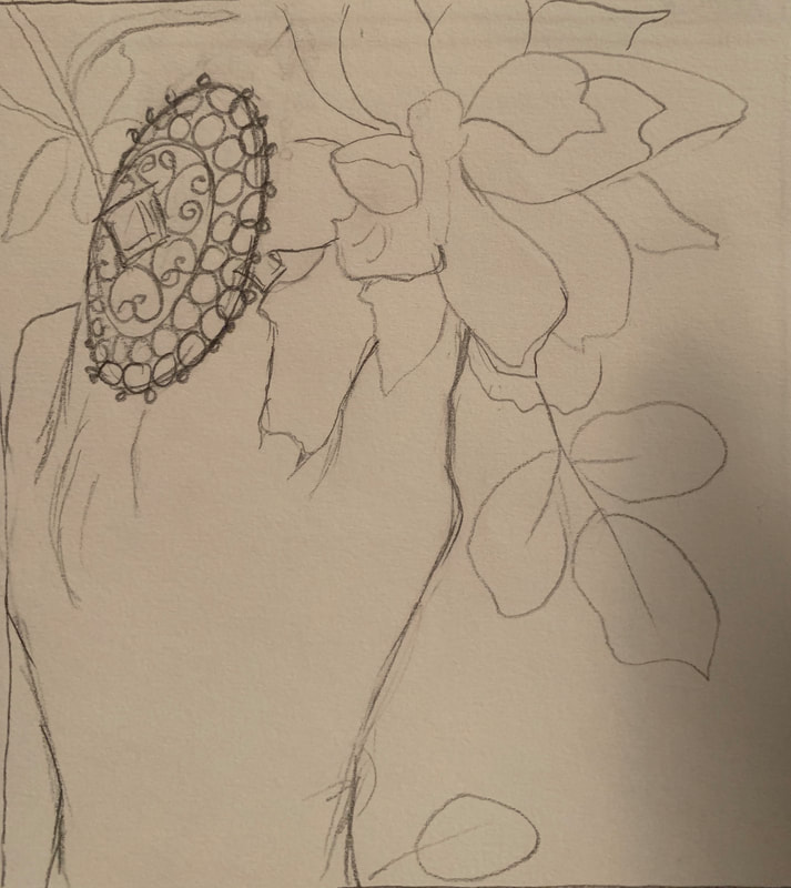
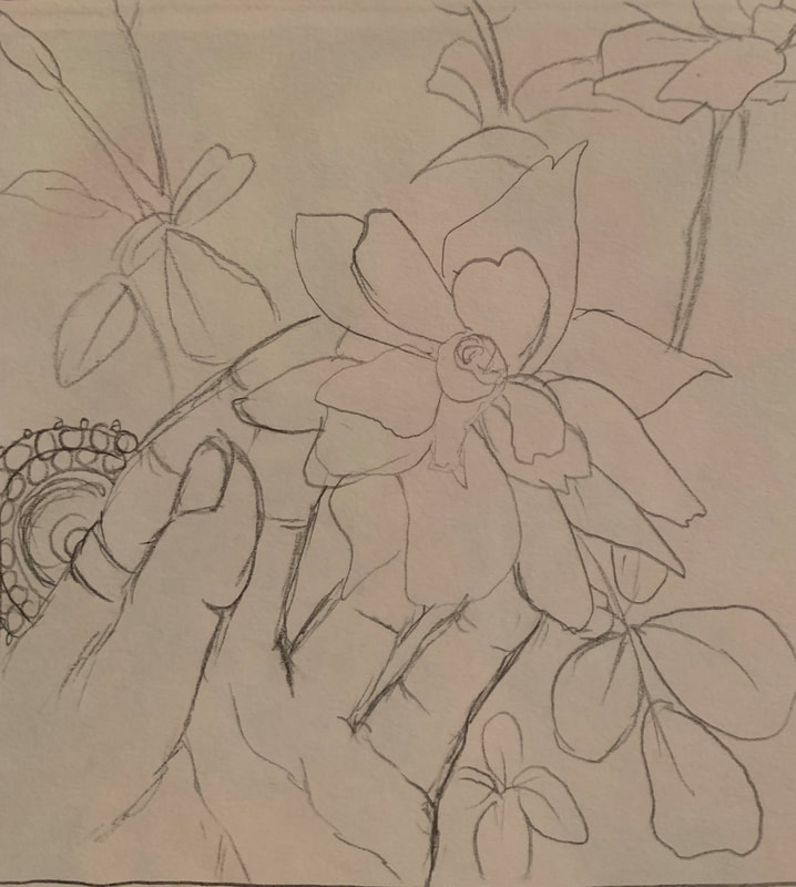
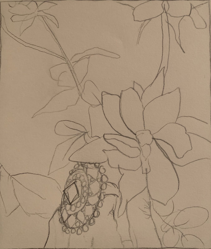
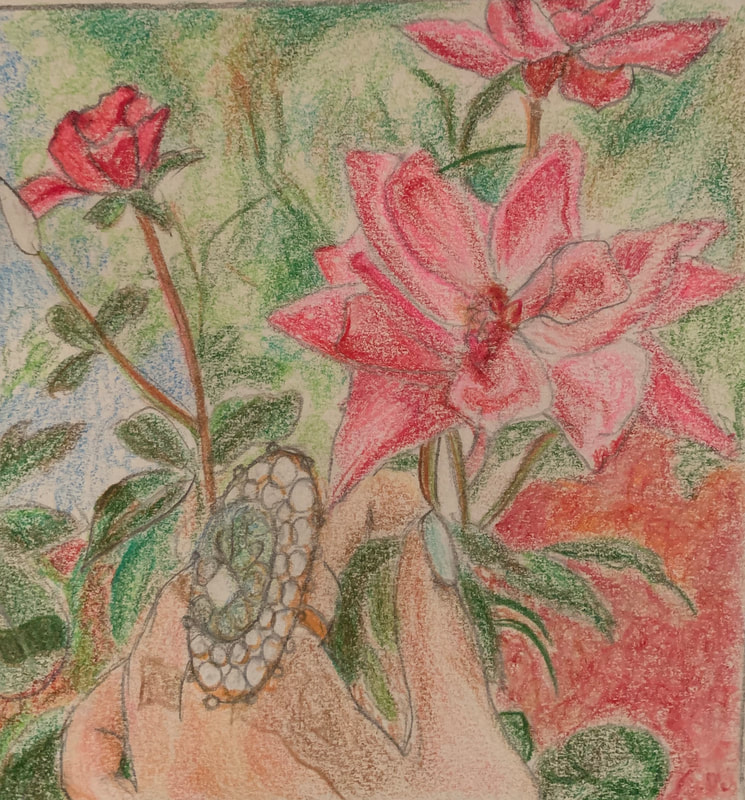
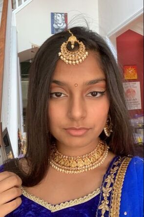
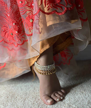
Reference Picture
|
|
|
|
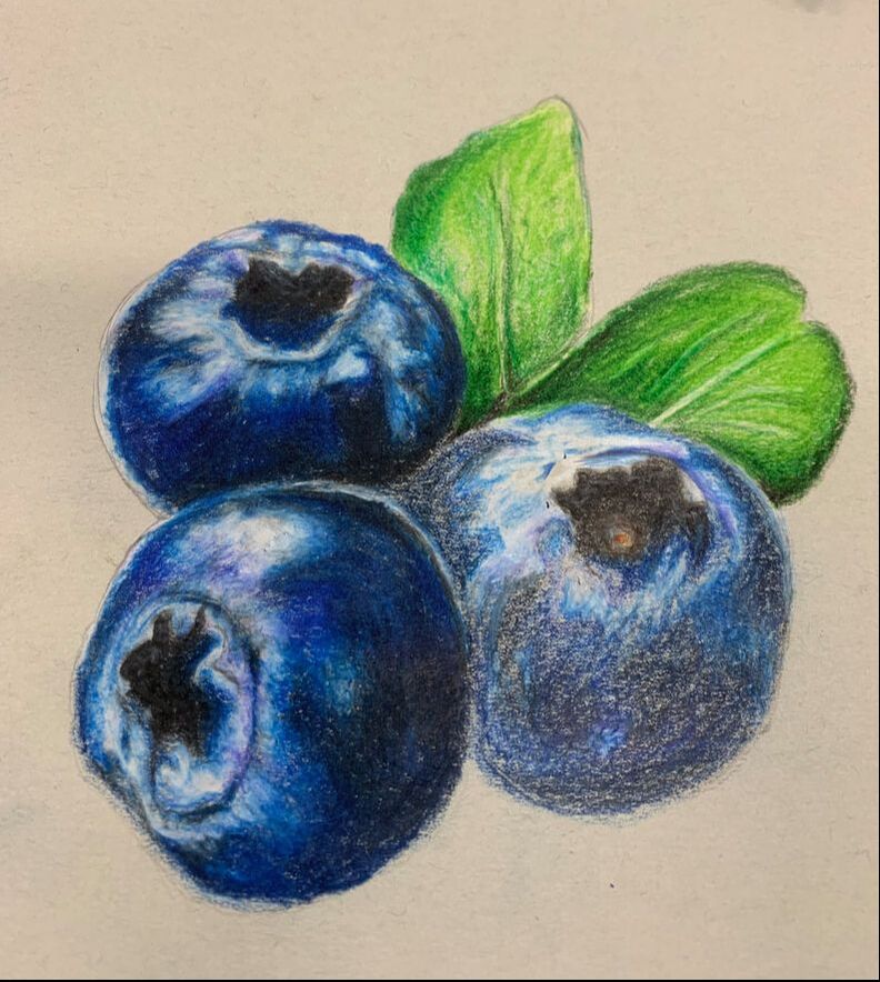
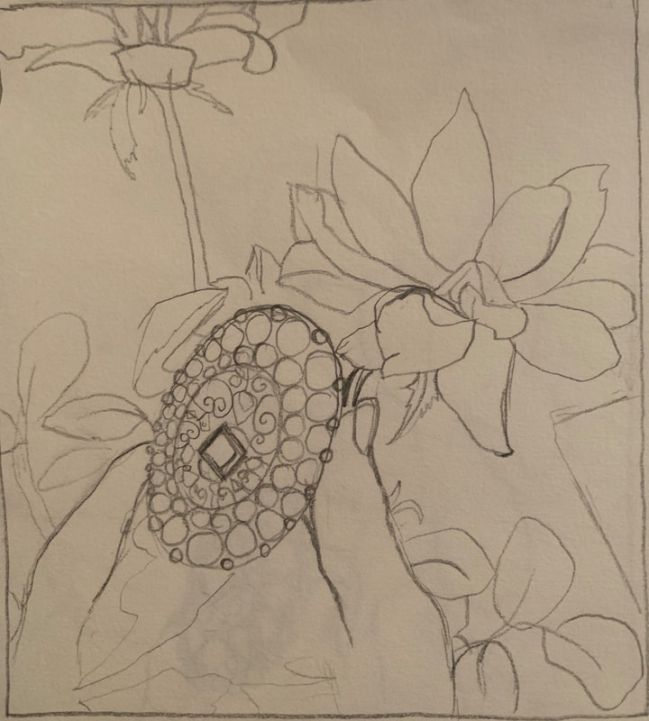
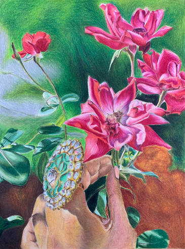
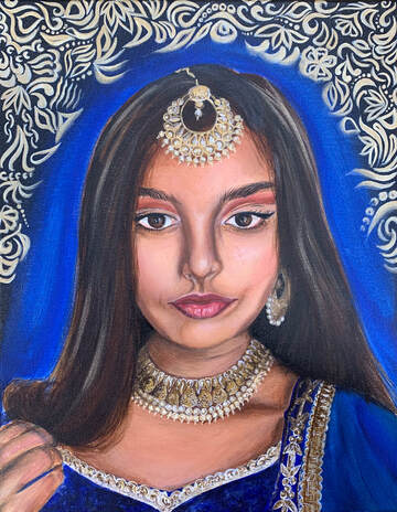
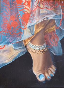
Final Drawing
|
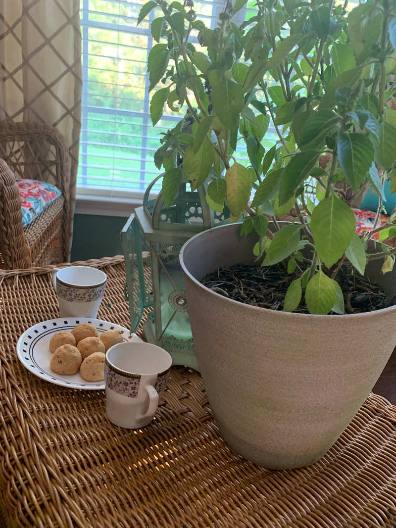
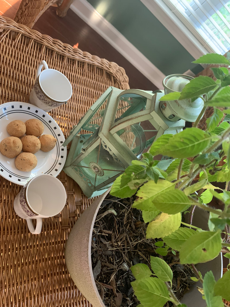
Reflection Project- In Progress Post
For this project I started with listing objects that reflect my identity and are actually reflective. After this I went home to find some of the objects and arrange them in different positions and took pictures to start the planning of my final idea. I found two choices for my final and made sketches and took position pictures for both. After the first sketches I chose one position for each and made a color sketch for each. I ended by choosing the idea with the flowers and the ring. I chose this idea because the ring from my collection of Indian jewelry represents a big part of my culture and the flowers are a part of my sense of home as they grow every year in front of my house.
|
|
|
|
|
|
Reflection Project- Final Post
|
Throughout this project I learned how to use unexpected colors of pencils to mix and create the look of the reference photo as close as I could. Some challenges I faced in this project was time management especially because you can't rush prismacolors because you need to layer them till they're opaque. While I was working on the project I started with the flowers and made my way out into the background. I decided to make the background blurred as I wanted the ring and flowers to stand out more than the smaller details in the back. One of the successes was the way I used the prismacolors because of how I got better as the project went on as it is not a medium I am used to. I definitely learned that layering light layers of different undertones makes a difference and will help me with future projects using the same medium.
|
|
Self Portrait Practice
|
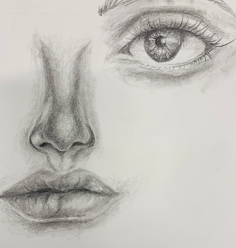
|
|
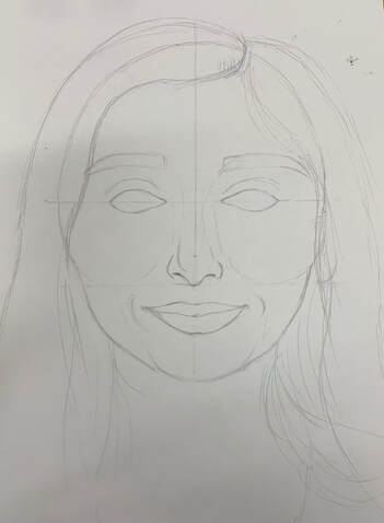
Self Portrait- In Progress Post
For my I brainstormed ideas to reflect my personality in the picture of me so I decided to wear jewelry and makeup while wearing a saree. I chose to use a selfie picture of me so I could see my face straight on to get the right proportions. For practice I started with a picture of me to sketch proportions out as I wanted it to be in the final project. I chose the idea of using my face in a recent picture because I liked the idea of showing my personality as it is now better than using a picture of the past.
|
|
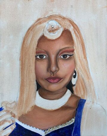
Self Portrait- Final Post
|
While painting this piece I faced challenges such as time management and getting the details in the jewelry accurate. I took a long time to finish but I am happy with the end product. For the jewelry I had to use many shades of brown and gold and white for highlights to get the closest to how the jewelry in the picture looks. To create this piece I started with taking the picture that I think shows off myself for a reference and started with a sketch and burnt sienna under-painting. Then I started with the face, specifically the skin and worked outwards. After finishing the whole figure I planned what to do for the background which I wanted to make more abstract as the figure was more realistic. I think the painting was successful in pulling out the darks and lights of my skin and capturing the look of my actual face. I also really liked the background in contrast to my face. Working with acrylic for this project was difficult because of how smooth I had to make the face and how I had to blend many colors without looking choppy. I think this project helped me get better at figure drawing and painting, focusing on the face, as I learned more about proportions and how to make a face look realistic. Using acrylics helped me learn how to blend fast and add color wash on top to achieve the final look.
|
|
Oil Paint Practice
|
|
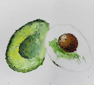
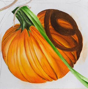
In this practice I used reference pictures of an avocado and a pumpkin to learn how to use oil paints to smooth blend and use a palette knife to paint.
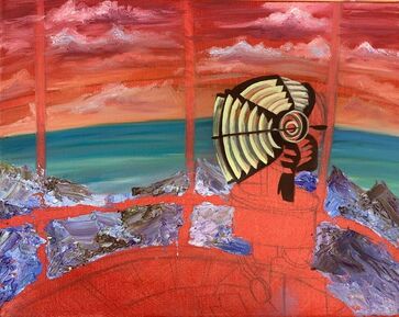
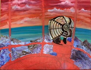
Interior Spaces- In Progress Post
To brainstorm for this project I listed out 20 ideas for interior spaces that I have seen or know about. At first I wanted to do inside a mirror but then I thought the composition might end up being too simple so I chose inside a lighthouse or greenhouse as my final choices. For both ideas I found pictures online to combine and create 5 composition sketches for each and choose my favorite to make a color sketch of. I chose to do the lighthouse because of the different perspectives I could choose from, including the top of the lighthouse and different views of the stairs leading to the top.
|
|
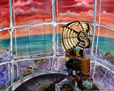
Interior Spaces- Final Post
|
In this painting the biggest challenge was color choice as I did not follow the color scheme of a picture for the final. I think in the end the colors were successful in creating the whole image and making sure each part of the painting contrasted to stand out. I started with an underpainting and drew the basic shapes based off of the pictures I used as a reference and made sure I liked the perspective of the light. I started with the background colors and continued onto the light and then the structure of the lighthouse. One of my favorite parts were the reflections I added to make the windows seem more like glass. I reached a point where I had to decide what colors to use for detail which was difficult, especially using oil paints, because I didn't want the rough textures and colors to blend in. I learned how to have more patience with oil paints and wait for it to dry to add more colors and details so I wouldn't have muddy colors. I will also use what I learned about perspective and how to use darks and lights of colors to show depth in the right places according to where the light is coming from.
|
|
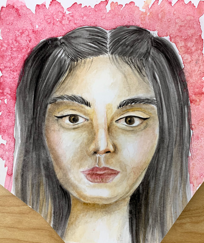
Ordinary to Extraordinary- In Progress Post
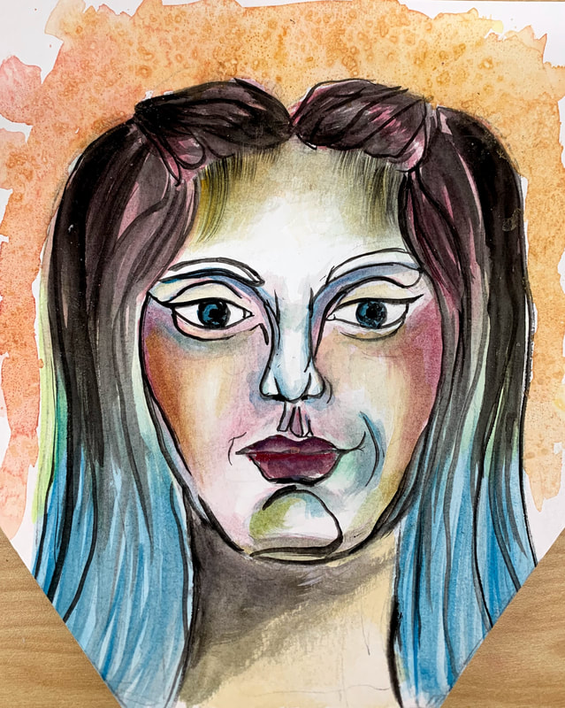
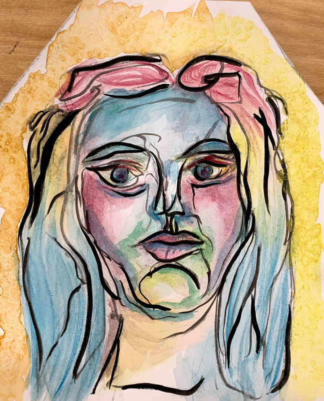
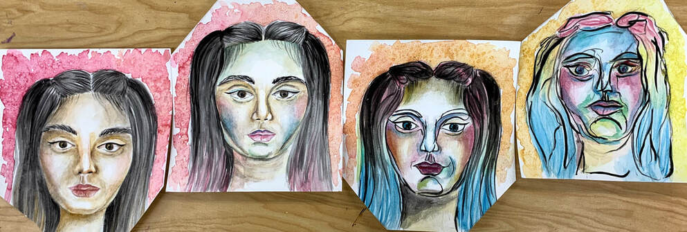
I wanted to take a different view of the assignment and use faces as the subject rather than what I usually do, nature and landscapes. I decided I wanted to do a series to show the ordinary face of a person progressing into a messy and unnatural face to represent getting deeper into someone's mind rather than looks. My idea was to go from realistic to a blind contour while playing with colors and lines in each piece of the series. I started with a sketch of each panel in my sketchbook to plan how I wanted it to turn out.
|

|
|
|
Ordinary to Extraordinary- Final Post
I faced challenges with time management as I took long on the previous projects and had a shorter amount of time to plan and complete these pieces. I chose to use watercolor as I wanted to play with different mediums and I liked the fact that watercolors could look realistic or have the light and splotchy texture. I started with panels of watercolor paper of the same size and sketched out each of the stages of the face that I wanted to paint. I started with the realistic skin colors and changed slowly into a more colorful palette. I added black outlines to add more to the change from realistic to not. I think I was successful in representing my idea and the meaning behind the art in my pieces. I learned to layer to increase detail using watercolor and just got more comfortable with the medium in general. I want to continue to work with watercolor and start using other mediums like it, for example inks, to do more of my art. I grew to like the medium and I want use it in the future along with learning more about human faces and bodies and implementing the figures more into my art.
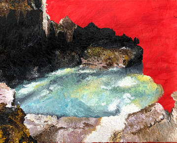
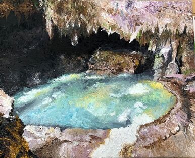
Landscape- In Progress Post
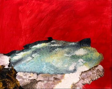
For this painting I brainstormed the idea by looking through pictures of landscapes from a trip that I went on to Mexico. I wanted to choose a picture from one of the caves I went to so I could capture all of the hidden colors of the water and rocks through knife painting. I like the mystery and darkness of the scene in contrast to the bright water and highlights. I chose to do this in knife painting to also show the texture of the rocks throughout.
|
|
Landscape- Final Post
|
During the painting process I had to overcome difficulties with getting the texture of the rocks and water to stand out from the background and still be at different levels of the piece. I started with a red underpainting and started applying colors with a palette knife starting with the middle ground and working outwards. For the rocks I tried to use more paint as they moved forward so that it would pop out more than the background. I think this painting was successful with bringing out the different colors in the water and rocks and the contrast between each component was apparent. I think using the palette knife helped me better understand how the thinness of oil paints affects the way it looks when paintings. I learned how to use one technique all throughout a painting and still make sure it doesn't look flat and plain. I will use more of the knife technique in future paintings.
|
|
Art 4 Reflection
Art 4 was an experience that has prepared me to plan my AP portfolio and get in order what I need to work on to complete the year successfully. Through the assignments given to us using different mediums and techniques I was able to expand my thoughts on how to create pieces and the skills that I carry into AP art. I learned about things I need to work on such as time management and a more in depth planning process before I start a piece. I have been able to also think of a concentration that matches my personality through exploration of subjects that I chose for my projects in art 4 and what we were assigned.
From all of the pieces I created in this class, I was most surprised by my self portrait, which turned out to also be my favorite from all I have completed this semester. I have only done a few figure paintings and have never painted a portrait of myself before this assignment. I also had to get used to painting with acrylics as there was a lot of smooth blending that had to be done before the base dried. I took a long time to finish this project but I was very happy with how the skin and details in the jewelry ended up. The background of the piece was a last minute decision since I was having trouble with how I wanted it to go with the realistic face, but it turned out to match nicely even though it was more abstract than I had first thought I wanted to make it. In the end I thought the painting ended up looking like me and I learned how to get correct proportions of a human face especially off of a picture.
Overall I practiced many different techniques and mediums including oils, acrylics, watercolors, and prismacolors to do knife painting, figure painting, landscapes, salt effect, and mixed media. Each piece was a different subject point and helped me find what I like to create while also thinking of the meaning behind the piece because of the assigned projects. I enjoyed this class and the teacher, especially how it was structured to prepare me for what's coming next semester.
AP Art
Week 1 Blog Post
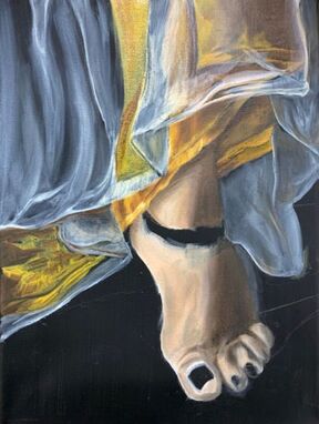
This week in the new semester was a start to my first piece for my concentration portfolio. I worked on a piece with an anklet and skirt on a black background. I finished working on the jewelry and most of the fabric excluding the final embroidery design. By using a black background I learned how to make the fabric seem more realistic by transparency and patchy blending. Overall I am happy with the result I am getting from the oil paints but I know the most difficult and detailed part is next with the design on the fabric.
|
|
|
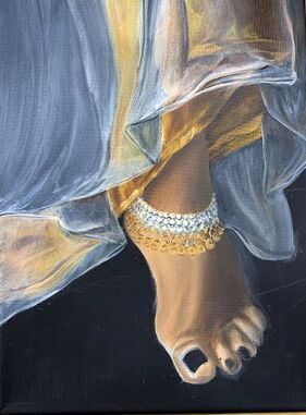
Week 2 Blog Post
In this week I continued and finished my first piece in the post above. I was so happy with how the fabric turned out and love the end result of the whole painting. In the fabric I can see all the layers and shadows of the colors and I focused on the embroidered design the most to make it realistic. I learned how to use oil paints to make very small and blended lines to give the illusion of the stitches in the embroidery. After I finished the basic coat of all the colors I went back in the end to add more contrast between the lights and darks to show how the stitches flowed with the fabric layers.
|
Week 3 Blog Post
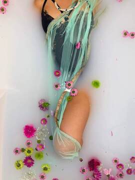
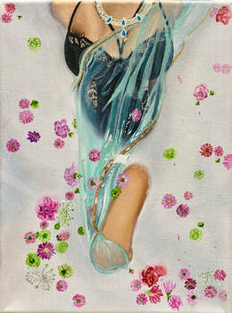
For this week I chose to do a painting off of a picture of me from a milk bath photoshoot that I set up. I used a picture as a reference to do an oil painting in which the techniques I used in the previous painting were repeated. I recreated the look of sheer and layered fabric using a green color on top of the figure. This painting was different in that my background is white based rather than black based like the last one. Because of this change, I had to make sure the green fabric was dark enough to show up on the white and light enough to stand out on the figure. I think one of the most interesting parts of this painting is the fact that I had to paint the figure emerging from milk and so the white background was blended into colors to show some depth while still being mostly white. I liked how the skin color turned out in the end too.
|
|
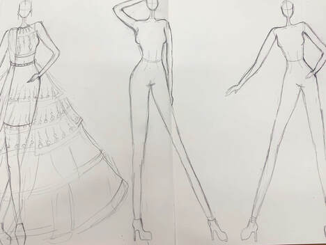
Week 4 Blog Post
This week I decided to start a planning sketchbook piece which I wanted to be more structured and thought out than a normal plan. I wanted to go along the theme of designing three dresses that fit my concentration on croquis and showing my process of design. I started with three fashion figures across two sketchbook pages and used a common theme of style and design. I used mixed media for the color part of the sketches. The first one that I finished was done in marker, color pencil, pen, and acrylic paint. Each of the mediums were used to show different fabrics, color and shine, and outlining the figure. I think what I found most successful was using the gold acrylic paint to paint on the embroidery design and define it with pen as I really liked how the portrayal of the fabric and design turned out with that.
|
|
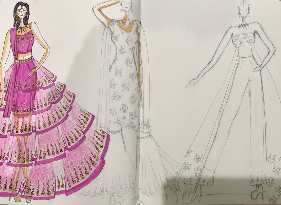
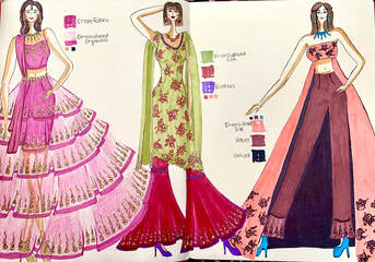
Week 5 Blog Post
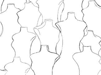
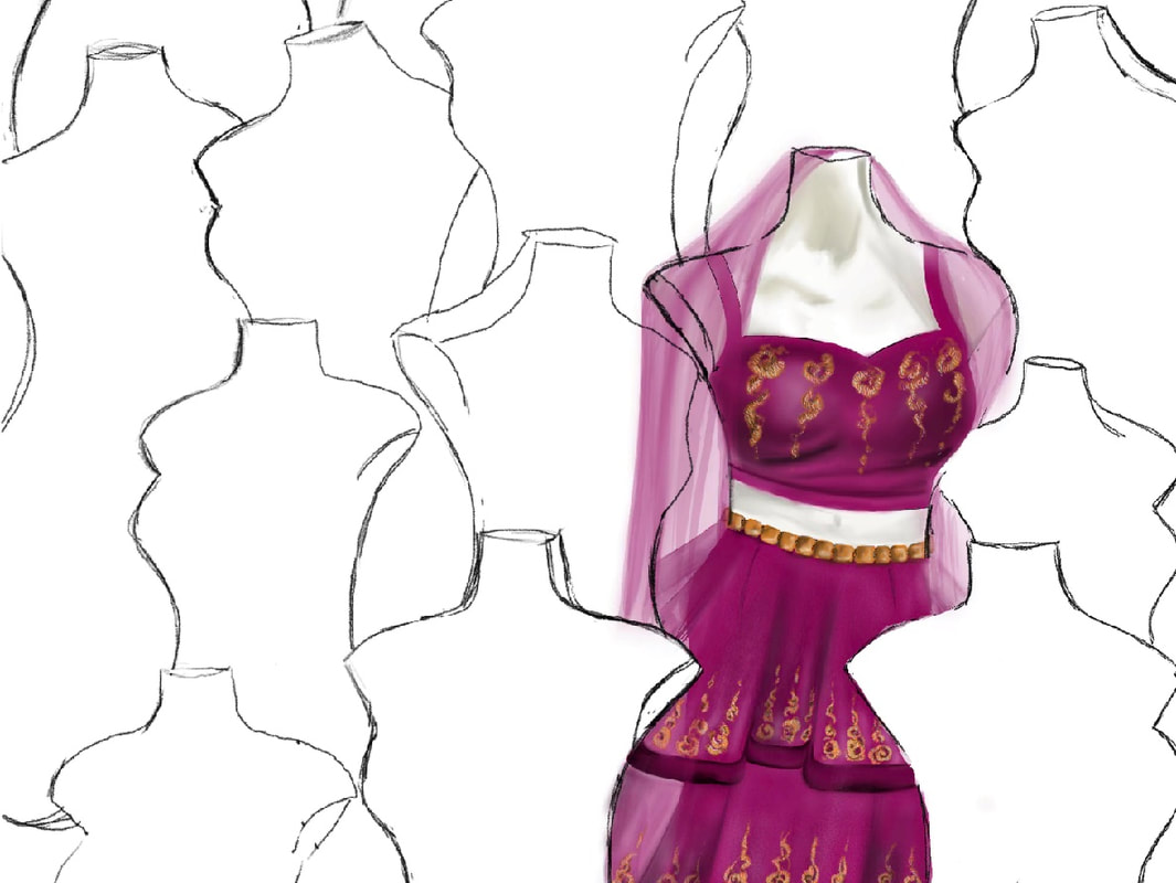
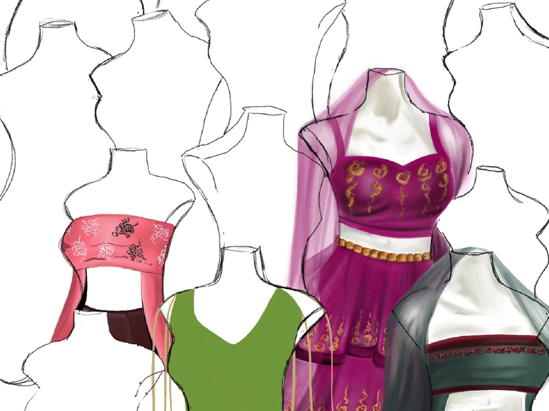
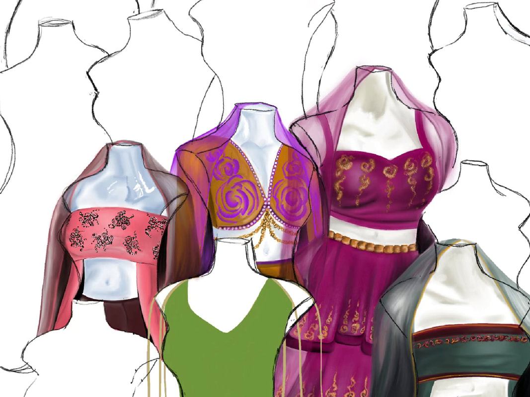
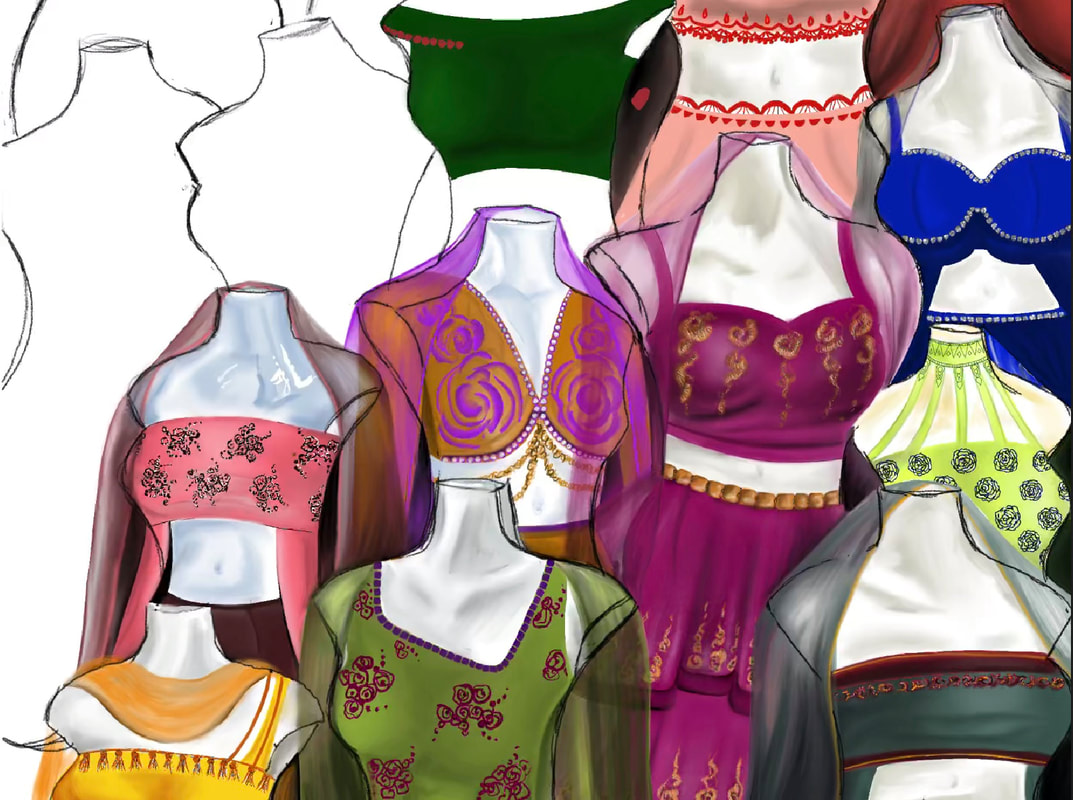
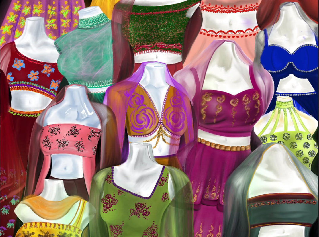
This week I have continued working on the sketchbook designs and planning what final piece I want to use them in. I colored in all of the sketches in color schemes that I liked and finished the embroidery details using white and gold paint. I found the arrangement of the croquis to be successful in the end as it filled up most of the pages and didn't overlap too much with each other. I also decided to add the color swatches and write the types of fabrics I would use if I were to make them. I think it added to emphasizing the color themes and detail of the overall sketchbook page. I used these croquis to build a plan for my final piece where I chose to do digitally. It is an arrangement of mannequins with different designs on them, all overlapping each other.
|
|
|
Week 6 Blog Post
In this week I continued working on my digital drawing and finishing it up while also taking reference pictures for my next piece. I added the other dresses I designed and just anything I came up with that I liked. I tried to keep the colors of all the dresses different while making sure it didn't clash with the colors around it. I think the most difficult part for me was getting used to doing a drawing digitally as this is my first one. It was more difficult to add as much detail as I usually do in paintings but I still liked how it turned out. I really like the composition of the piece as it's different than my other pieces. It's very busy but still all goes together. For my next piece I took pictures of myself in a pose that I liked to emphasize the dupatta (indian scarf) I wear. I decided it is going to be a painting.
|
|
|
|
